Editor’s note: This is one in an occasional series of stories that deconstruct innovative storytelling projects.
It started with a crazy idea, as many innovative things do.
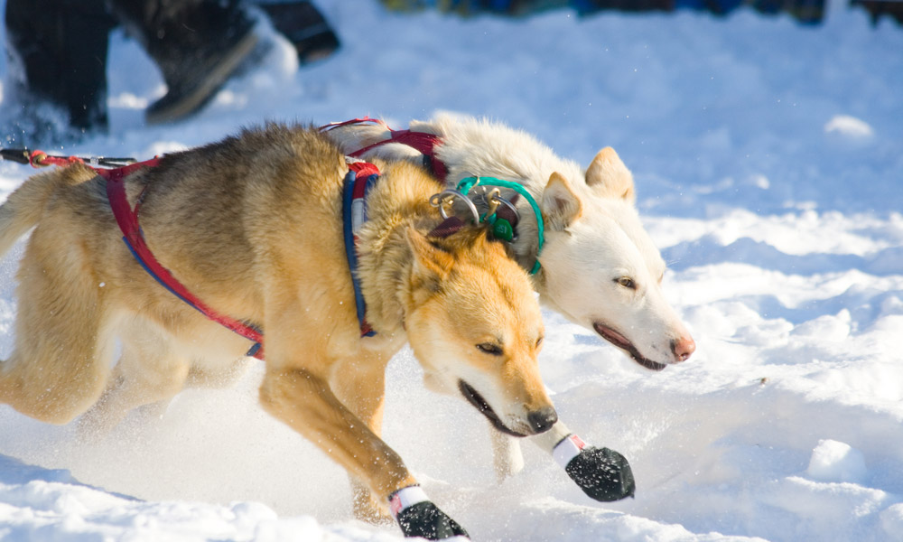
Brian Phillips — staff writer for sports website Grantland, perpetual email checker, snow hater and general homebody — wanted to follow the Iditarod Trail Sled Dog Race, which occurs every March in Alaska, and write about his experience.
His initial inspiration, before learning how to fly a plane and nearly becoming stranded in a blizzard: “At the beginning, I think what I was really drawn to was this image I had of a lone musher on an infinite field of white surrounded by whipping snow and wind, and what drove someone to do that,” Phillips said in a phone interview. “I just wanted to see it and try and figure it out.”
His current thoughts, after undergoing dangerous experiences and severe bouts of loneliness during his trip: “If I had known what it would entail from the moment we first talked about me going, I’m not sure I would have gone through with it.”
Despite the challenges he faced, Phillips produced a nearly 18,000-word epic titled “Out in the Great Alone.” Grantland published it in May 2013 as the test case for a new longform template, bringing together about 10 editors, designers and coders to turn the story into an interactive feature.
Related story: “Breathing New Life into Old Stories”
Special Challenges for Special Tale: Alaskan Wilderness
From the beginning, Grantland editors knew this story would be ambitious. They wanted the design to match the level of the writing, or as director of business development David Cho said, to continue Grantland founder Bill Simmons’ mantra of “trying new s—.”
Sarah Larimer, the Grantland editor who served as the point person on “Out in the Great Alone,” said Phillips had pitched several travel stories, but this was the one where she felt he could “tell a unique and special tale.”
“He writes very well about things like loneliness and community and all these things that are kind of on the outside of sports,” Larimer said.
She helped Phillips prepare for the trip, which posed a few unusual problems from the outset.
1. How to photograph. No, he couldn’t use his iPhone. In fact, he couldn’t use any sort of standard camera either; it would freeze in the cold Alaskan weather. They ended up securing one at the last minute that could work.
2. How to actually follow the Iditarod. Larimer had an old friend in the Air Force who was stationed in Alaska. When she contacted him and asked about the best way to hypothetically follow the race, he told her to find a Super Cub plane. “They’re kind of dangerous, though,” he added. “If they crash, you’ll never recover the body.”
Despite these warnings, Grantland went ahead and contacted a bush pilot, Jay Baldwin, who was trained to fly tiny planes. Phillips was allowed to select one of the four planes Baldwin owned. He chose the one with the smallest engine, a yellow contraption named Nugget that he said was about the same size as the Chevy Traverse SUV he had rented.
Phillips encountered a few setbacks once he arrived at the race, too. There were irritating things, like discovering that The New Yorker and several other outlets were also covering the Iditarod, so his piece would need to be published sooner than planned. Then came frustrating things, like accidentally locking himself out of his room in Takotna, one of the checkpoints along the route. Finally, there were the nerve-wracking things, like landing on a frozen river in the middle of a blizzard with the impression that he’d have to dig a snow cave and spend the night. Luckily, Phillips and his pilot were able to take off.
“We would have been fine,” Phillips wrote in the piece, brushing off the experience. “Uncomfortable, but we’d have survived.”
Yet: “There were moments where I was just really alone and sad,” Phillips recalled, “and I wanted nothing more than to be back in the lower 48 in a coffee shop working at a laptop.”
Designing for ‘Literary Elegance,’ But How?
Phillips spent three weeks wandering around the Alaskan wilderness and then about 10 days writing his article. Yet the editorial team he left behind — split between Los Angeles and Bristol, Conn. — worked on the project for nearly two months, communicating with Phillips by text message when they could. ESPN art director Keir Novesky and associate art director Heather Donahue were in charge of the design aspects, while David Cho, Grantland’s director of business development, served as a manager, reminding the team about goals and logistics.
The team’s goal was to produce a different kind of project, one that was pioneering in writing and design but grounded in traditional print tenets, including good storytelling. The design was crucial in creating this tone; even the light blue color used to highlight certain parts of the text and denote more information in the rail was thought to be “too modern” at one point.
“Everything now is so shiny and has to look new,” Cho said. “There’s still a place for literary elegance.”
Novesky said The New York Times’ “Snow Fall” piece heavily influenced the project, but Grantland wanted to frame its piece in a slightly different light.
“It was the best execution of that sort of story in our eyes, and we were definitely trying to take in all that they did, ” Novesky said. “But we all agreed that a lot of their breaks in the stories to show off their infographics were a little disrupting at times. Even though they were super cool and looked great, we wanted the main attraction here to be the actual work itself.”
The element that took the most time (three weeks) was the map, which appears after the prologue section of the article and remains at the top of the page until the end. As the reader scrolls down and the story progresses, a turquoise line traces Phillips’ route across Alaska.
“We really wanted to have the user feel like they were following along in his experience, jumping from one checkpoint to another,” Donahue said. “That was crucial to the whole piece.”
Since the map is present for the majority of the article, the designers felt the rest of the additional elements — photos, infographics, audio, video — needed to be static. The videos don’t automatically play; the animal illustrations are done in black-and-white; all but one of the landscape images that separate the piece into “chapters” are simply photos — no swirling snow, no moving text.
Readers Hit “Like” Button, Reach Finish Line
This strategy seems to have worked. Grantland’s policies prohibit editors from discussing metrics with media — and Larimer said she never looks at traffic numbers anyway — but anecdotally, “Out in the Great Alone” has received widespread praise.
“Universally, people were so supportive,” Cho said. “I guess Twitter makes that sort of stuff possible. It was really interesting because it was the first time we put something out, and out of the gate, people were saying, ‘I’m glad this exists.’”
Novesky said he read all the comments, and one of the most common remarks was that the user actually read the whole piece.
“That’s huge for me,” he said. “Getting people to finish a long story like this without complaining about the design or seeing the design as the forefront here, that makes me happy.”
Since Grantland is supported by ESPN, it does not depend on revenue made from the site as much as other outlets do. However, the positive response to “Out in the Great Alone” does make the editors and designers more confident in devoting time and resources to longform stories.
Phillips attributes the positive response mostly to the rest of his team, who cropped and touched up a few of his 2,800 photos to fit well in the piece; sent his article through several rounds of efficient edits and managed to put together a beautiful design while still working their regular jobs.
“Collaboration really played a big role here,” Donahue agreed. “I think that’s where this piece really succeeded. A lot of people these days work in silos, and that doesn’t necessarily create the best product in the world.”


