
Gary A. Seidman worked in news for two decades before leaving in 2007 to create his own interactive agency, Switchyard Media, in anticipation of what he saw as a “big evolutionary change in journalism.”
A founding editor of MSNBC.com, Seidman worked at its Redmond, Washington headquarters for a decade before deciding to start a company that specialized in interactive infographics, data visualizations and narrative stories.
Back in 2007, when Switchyard set up shop in Seattle, that meant producing interactive content for news clients. Today that usually means creating visuals to tell the stories of nonprofits and “agenda-oriented” organizations.
Switchyard is full of former journalists, and that’s no coincidence. Seidman has ensured that even the graphic artists have news backgrounds. With four full-time employees and many freelancers, Switchyard operates a lot like a virtual newsroom: writers from across the country assemble with graphic artists and producers in Seattle every other week or so.
Increasingly, PR and creative agencies are following Switchyard’s model of creating ostensible news teams to better serve an array of clients wanting to directly reach its audiences.
AJR talked to Seidman, whose early journalism background includes stints with CNN and The Economist, about visual and interactive journalism, the details behind Switchyard’s creative process, and how it keeps the reporting spirit intact while producing content for paying clients.
This interview has been lightly edited and organized for clarity.
Gary A. Seidman, Switchyard Media
American Journalism Review: Tell us a little bit about who you are: how did Switchyard start? Why did you leave traditional journalism? Was this what you envisioned for the company?
Gary A. Seidman: I came from a long career as a traditional journalist directly from MSNBC.com. The types of things getting a lot of views were slideshows and image-oriented journalism. It became very clear from a metric-oriented point of view that I could make a job of this on my own.
I was looking to have a marriage of both the journalism and technology. At that point, in 2006, 2007, it was pretty clear there was going to be some type of a big evolutionary change in journalism.
I wanted to tell real stories. I didn’t want to just do soft news oriented toward getting page views. Large organizations are still chasing page views, because that’s how advertisers are paying them.
In 2007, almost every client I had was chasing page views. They wanted content that would be … well, we’d do a lot of slideshows, for example. Slideshows are lucrative to those organizations. We’d be able to take a New York Times-sized article, 800 to 1,000 words. … Switchyard could break it up into 10 subheads, and give each subhead a slide. It’s lucrative because they could sell an ad for each of those slides.
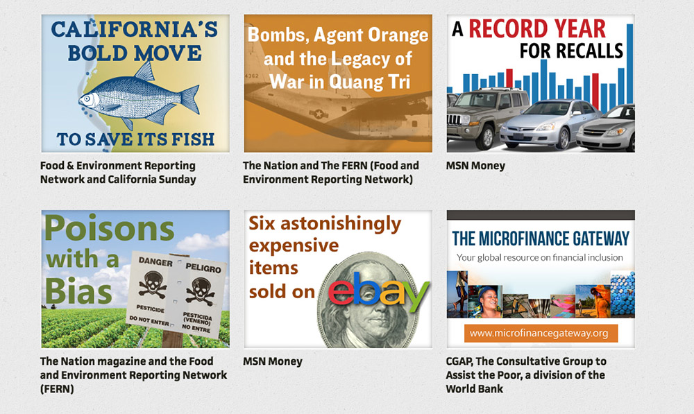
We still have a client or two who’s very interested in getting the metrics for selling ads, essentially getting page views, but most of our clients now are paying us to summarize oftentimes very complex info, mostly into infographics. I’d say 70 percent of our work is infographics or interactives now. We can summarize information into visuals that can be explained pretty quickly and pretty clearly. It’s not as concerned with the economics that way.
Our client base has changed pretty dramatically in the last few years. The client base was almost exclusively editorial organizations when we first started; they would range from news organizations – MSNBC, MSN, hgtv.com, places like that. They definitely made their digital revenue by selling ads. We did a lot of work to feed that appetite for page views. Now our clients are rarely news organizations; the majority of our clients are usually nonprofits, international organizations – the World Bank, the U.N – wanting us to explain information in a visual way.
As news organizations have shrunk over last 10 years or so, there’s been a void of telling stories, and it’s been filled by other organizations. A lot of nonprofits now are telling stories. Sometimes news organizations will pick up stories and … some of our clients actually depend on that. An agenda-oriented nonprofit can feed those stories to news organizations and have us provide graphical explainers. The journalists still need to be very critical about who’s providing their information.
We never will do something that doesn’t seem like it’s a legitimate newsy piece. If some organization comes to me that I’ve never heard of… our editors will scrupulously look through that data; do we really believe this? Sometimes it doesn’t really rise to that level, and we’ll bring that to the attention of the client. If a client has data that we’re skeptical of, we’ll press them to see if there’s better data they can come up with. If there isn’t, we’ll drop a project.
AJR: How do you operate? What’s a day at Switchyard like?
Seidman: We work on a lot of projects at once. Some take a month or two months to do. It works in a couple of different ways.
Frequency of projects varies greatly. For example, we produce weekly infographics for one client. For another client we produce about three to five articles or slideshow articles each week. For yet another regular client, we do all of their daily photo research and editing.
We tend to also deliver between one to four big projects every week. Those range from complicated infographics to motion graphics and animations that could take several weeks to produce.
We just finished a project for the World Bank, a complicated project basically on eradicating poverty. It was complicated and involved a lot of organizations, academics [including] professors from Yale.
They send us a ton of data, numbers, fact sheets. We go through it like we would as if we’re an actual true news organization: What do we think is the actual story here? What would most interest the public? We write a summary. We think these are the key points. We structure it almost like we would structure an article: This is the lead; this is the corroborating data; this is what we would show with it. We bring it to the client and ask them to go over it with us and review it. Ninety percent of the time we’re on the right track because they want to tell the story the data tells.
We write a script: Here’s the image we want to use with the headline. Here’s the lead paragraph; here are some images that would go with the lead paragraph, maybe some charts or graphs that explain it. Our editors work that way, very visually. They’re more like TV editors than print journalists. We want to show the info visually.
There is a visual style to it, we’re working for a client – not just ourselves – so we want to make sure the style matches the style of the organization. They’ll show us the colors they use, the fonts, the look and feel of their illustrations. We’ll combine all of that into a presentation for them. We work on the words first, then the images, and our editors will work with our graphic artists on those.
The fewer the words the better. We’ll use visuals as much as possible to explain things without words, if possible. It’s a very collaborative back-and-forth process. Especially with the World Bank and the U.N., there’s a lot of stakeholders and a lot of people involved.
What we do is translate this jargon-y language into language that can be understood by the general public. We’re essentially interviewing our clients: “You want tell a story about poverty? OK. We’re going to ask you a ton of questions here, we’re going to go back, we’re going to write it up, and we’re going to send it to you.” And we’ll say, “Did we get it right?” Rarely are they controversial. Generally they come back and say we’re pretty much on the right track. We try to use a journalistic format for the creative process.
We can whip together a graphic that will convey information quickly. And sometimes you need to sit down and think about the best visual way of telling a story and sometimes that can take you a little while to do. It’s a little bit of both.
AJR: How do you combine journalists and tech people and digital people and get them all to work together and mesh well?
Seidman: Sometimes you run into people who are great graphic artists, but… we’re trying to combine art and information, and I think you do need a little bit of a sense of what visuals really can convey information succinctly and quickly. An infographic is essentially like an executive summary of data.
For any project, generally two to three people are working on it. The editor/writer-editor type person is the person who’s talking to the client, gathering information, and taking that information and writing it up, in a very classic journalistic way. That’s kind of step No. 1. They write up the script – it’s a summary that will have the headline we want, the deck we want, and the visuals we want to show.
Then the artist will determine the style we want. Most of the time we nail it; we have a good sense of what their website and stuff looks like. Once we’ve got signoff on that, the writer will collaborate very closely with the artist.
For more sophisticated interactive projects we use larger teams. Often times a writer and editor work with a graphic artist, photographer, videographer and interactive producer. And if there is animation or video involved, we may also bring in an AfterAffects specialist and voice-over narrator. The bottom line is that a collaborating team starts with two people but could expand depending on complexity of the project.
Interactives have mechanical considerations. Where are you going to show it, what kind of website, what kind of dimensions; what kind of digital format can you support?
AJR: What has been your favorite project so far? What kind of projects does Switchyard like to take on?
Seidman: We’re working on a project right now that we like doing. It’s really visual – it’s for [philanthropist and Microsoft co-founder] Paul Allen … on the great elephant census in Africa. It’s this study that they’re running, it’s a good project, a good mission [with] some really good visuals.
We did a nice interactive project for the Gates Foundation. Bill Gates was giving a presentation, and he was able to click through this interactive that we made.
Sometimes it’s really nice to just do stuff that will be seen by policymakers or by people that have the opportunity to make change. We did something last summer for the World Health Organization that was presented at the U.N. General Assembly. It’s nice to be able to work with organizations that are doing good. A lot of things we do are international, so they don’t show up in American press a lot.
It is a business, and there’s still a bottom line and all those financial elements to keep the business alive. … There are times when we’re asked to do a silly story on something, or something that’s just for a pop-culture client. You have to do what you have to do to make sure you can finance the stuff you want to do.
AJR: Why interactive journalism? And why the emphasis on visuals?
Seidman: A lot of the stuff we do is international, so a lot of the audience is not native English speakers. … Sometimes it’s hard to know how a visual kind of presentation can oftentimes be better than just a written article, how it can convey information quickly, and make it easy to understand without reading a lot.
I think people wanted stuff fast in 2007, but they want it faster in 2015. I started with Reuters. Even in the 1980s, how fast you got your story out versus how fast the AP got theirs out was timed. People knew that. I think the advent of the web has allowed people to use the dimension of visuals to get information even more quickly.