

Editor’s Note: This article is part of Storybase, a series of occasional articles exploring new forms of interactive storytelling.
The St. Louis Post-Dispatch struggled with a problem familiar to digital news producers everywhere during its coverage of the Michael Brown shooting and subsequent unrest in Ferguson, Mo. — how best to present the avalanche of stories its journalists spit out on a running national news story, in order to help readers dive deeper into the back story.
It took six months after a police officer shot and killed the unarmed 18-year-old last August before the news team at the Post-Dispatch developed a solution. Last month, the newspaper’s website unveiled its first large-scale interactive project, “Ferguson,” a curation of over six months of coverage of the shooting and wave of protests it unleashed. The project features more than 100 articles, all organized by topic and chronology to help readers better digest this ongoing story.
“We didn’t really have a great place that organized all of our best and most important coverage in a clean way,” Chris Spurlock, online graphics editor, said in an interview. “We wanted to be able to give that to them, not only as a reader service but as our own sort of organizational tool.”
A diverse team of seven editorial, graphic design and reader engagement editors met in December 2014 following the grand jury decision, finally able to sit down and discuss just how to make order out of the past several months of content.
“We …. started mapping out what exactly we wanted to produce and how we wanted to present it to people,” said Spurlock. “We wanted to really emphasize the fact that it was so much more than this particular incident that incited all of this emotion in people.”
Assistant Managing Editor, Projects Jean Buchanan and Reader Engagement Director Beth O’Malley began organizing the coverage using a running spreadsheet Buchanan had created of all the Post-Dispatch’s daily coverage.
“It’s hard to go on the site and just search for a story,” Buchanan said. “We decided on trying to curate all of the content through some key ideas.”
O’Malley began categorizing each story through archival tagging that would group all of the stories in different archive pages according to topic. From there, a collection of six to eight stories deemed essential to each aspect of the story were selected and linked to directly on the project’s main page. O’Malley also worked to compile supplementary multimedia elements.
“We wanted to make sure our online presentation was reader-friendly, so my role was to make sure the featured stories had links to other stories, videos, photo galleries and HTML-based presentations,” O’Malley said in an email.
Spurlock began working on a mock-up for what the site would look like. The final product includes a single landing page that readers can then scroll through to different sections, such as “Shooting” and “Civil Rights,” where they can discover essential reporting, links to more stories and multimedia content. Spurlock was also able to easily adapt the site’s minimalist design for their mobile platforms.
“We wanted to make sure it looked as clean and nice as it does on desktop on mobile,” he said. “We figured this would be shared on Twitter and Facebook and lot of people would be accessing it from their mobile devices.”
In total, the most recent tally shows the Ferguson project attracted 82,000 views from 15,000 users, according to Bob Rose, deputy managing editor. The average time on the site for each visit is about 32 seconds, he said.
Rose characterized traffic performance on the Ferguson project as “one of our more successful ones, at the higher end. … I would say a typical big enterprise project like that would be 40 [thousand] to 50,000 views.”
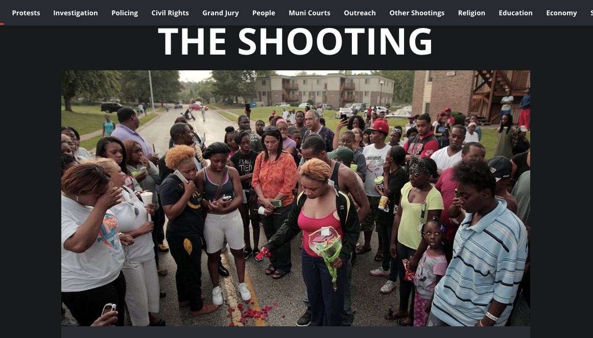
The project contains a sizable amount of photo galleries and videos; each section is accompanied by a powerful photograph that was selected through collaboration with the photo editing team.
“The photography produced during those months has been spectacular, and we all had a desire that we would plant photos in a striking way and draw people in,” said Buchanan.
Notably missing from the page’s design is any form of advertisements. However, revenue and page views were not the first priority during the project’s conception.
“The traffic on our coverage was huge, so we didn’t go into it with any goals for page views,” Buchanan said. “This is more of a service to readers, people coming fresh to it and the staff to help them look back and find things more easily.”
“We wanted it to be something that people bookmark for later and then on Sunday open it up and really comb through it,” Spurlock said.
This is not the Post-Dispatch’s first foray into interactive storytelling. While the story was unfolding, the paper utilized a tool called SoundCite from the Knight Lab at Northwestern University to embed audio clips from Darren Wilson’s radio calls into the text of the story. However, after producing “Ferguson,” the team hopes to try this style of storytelling more often.
“It’s been a slow build, but now I think people are realizing there is more potential for doing things like this,” Spurlock said. “Getting people to think outside the box presentation-wise is helpful.”
However, the work on “Ferguson” is far from done. The team hopes to continue to update the piece as time goes on.
“Any story that we feel like is a touchstone piece will most likely be added,” Spurlock said. “There is a plan to keep it as a living document; the story is still unfolding.”
See previous articles from our series on interactive storytelling:
Meet the Reporter Who Used Data to ‘Take Punxsutawney Phil Down’
Here’s One Way to Tell Stories About Race: Remove the Journalists
The Huffington Post’s Deep Look at Heroin Addiction