

This article summarizes a research paper presented at the 2014 Computation + Journalism Symposium. Nick Diakopoulos is co-chair of the organizing committee and an assistant professor at the University of Maryland Philip Merrill College of Journalism. See the full collection of research summaries.
In early October this year, LinkedIn dropped some data on the world of college rankings. By analyzing employment patterns from 300 million users, it was able to create school rankings based on the career outcomes of graduates. And whereas a school like Hofstra University is ranked nationally at a lowly No. 135 by U.S. News & World Report, LinkedIn has it swinging at a much higher weight: No. 2 for “Media Professionals” for example.
Rankings can sometimes be a mystery. It’s difficult to know exactly what’s feeding into them and how the various data sources are weighted and re-combined to result in a final ranking. Yet rankings can be incredibly important decision-making tools in our lives, informing everything from the day-to-day choice of a restaurant reservation, to the potentially life-changing decision of what university to attend.
Responsibly and accountably communicating data-driven rankings to the public opens a host of interesting questions in computational and data journalism. While such rankings may appear authoritative due to their quantification, editorial decisions abound: from how data inputs are defined, to what’s included or excluded, the weights of the inputs and even the algorithm used to synthesize the ranking. How might we redesign rankings to communicate these kinds of decisions more effectively?
In our work we consider the design and development of a specific data-driven ranking published by IEEE Spectrum on the top programming languages (shown below). The ranking incorporates 12 different metrics from 10 different data sources, including everything from the number of search hits the language receives on Google, to the number of questions asked about it on Stack Overflow and even how many job postings mention the language on CareerBuilder. Each of these data sources was carefully considered as to its comprehensiveness, any rate limits imposed by the data provider that might affect the feasibility of collecting enough data to provide a reliable signal, the ability to avoid query collisions (e.g. between languages like “C” and “C++”), the ability to limit the data source to a time range (e.g. just for 2013) and any legal liabilities or terms of use considerations.
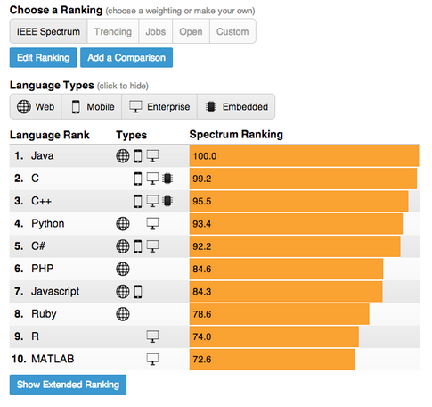
A screenshot of the user interface of the IEEE ranking of programming languages.
Our design allows for the data inputs to be re-weighted, and for users to see how various combinations of data inputs or weightings affect the output ranking. Essentially we allow for more transparency in our ranking algorithm and enable new forms of interactivity with that ranking. We also thought that this design could serve as an entry-point for engagement so that users could express disagreement with the editorial choices or weights that we had set as defaults. The following figure shows how a user can manipulate the data sources and weights and save those edits as a custom ranking. There are also weighting presets for things like “jobs” or “open source” that quickly prioritize the influence of different data sources on arriving at the final ranking.
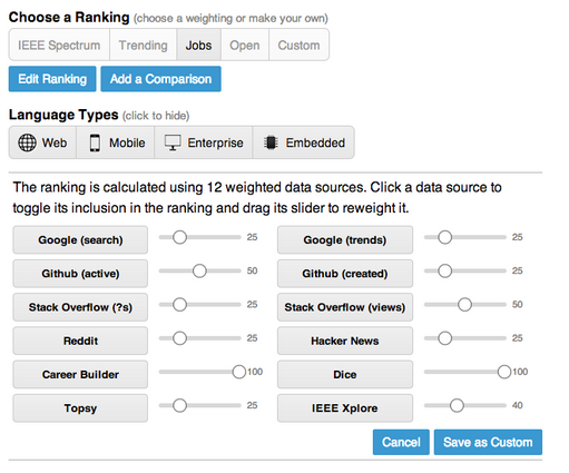
The interface allows users to assign different weights to different ranking criteria. In this screenshot, the user has assigned more weight to data from CareerBuilder and Dice, two job posting sites.
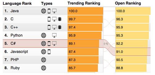
An advanced feature then allows the user to visually compare two different rankings. So for instance in the figure below, the trending ranking is compared to the open source ranking and the user can quickly see how a language like C# (selected) moves up or down between the rankings.
The interface allows users to see how a programming language’s popularity is affected by two different sets of rankings.
We studied the social media response as a way to better understand how people were using this app and the new features we had built. In the two weeks after publication on July 1, there were 1,285 tweets, almost 1,500 Facebook shares, and more than 270 comments made on the site. Of the 1,285 tweets there were 881 original and 441 retweets. By analyzing the URLs of the tweets that were shared we found that about 16 percent of the original tweets indicated that the user had editing the rankings or weights in some way. However none of the shared URLs indicated that users were sharing a comparison view of rankings. Perhaps this feature was not compelling enough for users to share, or was not prominent enough in the interface.
We also analyzed the 278 comments that were made to the app in the first two weeks of July. We found that many of the comments to the app introduced various aspects of context from personal or professional experience relating to the various languages. Other comments were critical, though often in productive ways, like pointing out issues related to missing items, the distinguishability of items, the choice of data sources, classification decisions, or the definitions used.
Many of the criticisms brought up in the comments related in some way to the various editorial decisions that had been made in the course of designing the app. If nothing else, such criticism can be useful for ongoing iterative human-centered design; it underscores boundary cases relating to editorial decisions of inclusion, exclusion, or classification that might be fruitfully addressed in future versions of the app.
At the same time, the cracks in interpretation exposed through critical comments also suggest that providing space for ambiguity in data journalism may create opportunities for the user to engage in co-constructed meaning. Data journalism is anything but objective, and it is at the boundaries of interpretations that the dialogic flourishes.
We see the IEEE rankings as a first step in thinking about increased transparency of ranking algorithms online. But our results show that only about 16 percent of users deeply engaged the re-weighting and editing mechanisms. There is exciting work to do in human-computer interaction and visualization design to develop rankings that expose the various editorial criteria in ways that are useful and usable by end-users.


Leave a Comment