

Editor’s Note: This article is part of Storybase, a series of occasional articles exploring new forms of interactive storytelling.
Kennedy Elliott, a graphics editor for The Washington Post, usually works on complex data visualizations of political topics. She recently was part of a team that created online graphics to tell the story of the 119 detainees held in CIA secret prisons. She

Kennedy Elliott, a graphics editor at The Washington Post.
also worked on the story that visualized the choice of words that presidents used in State of the Union addresses since 1900.
But a recent conversation with family that lingered on the topic of Groundhog Day led Elliott down a different path.
She decided to dive into a completely different kind of data, centered on whether a rodent who likes to hide in burrows could accurately predict the end of another miserable winter.
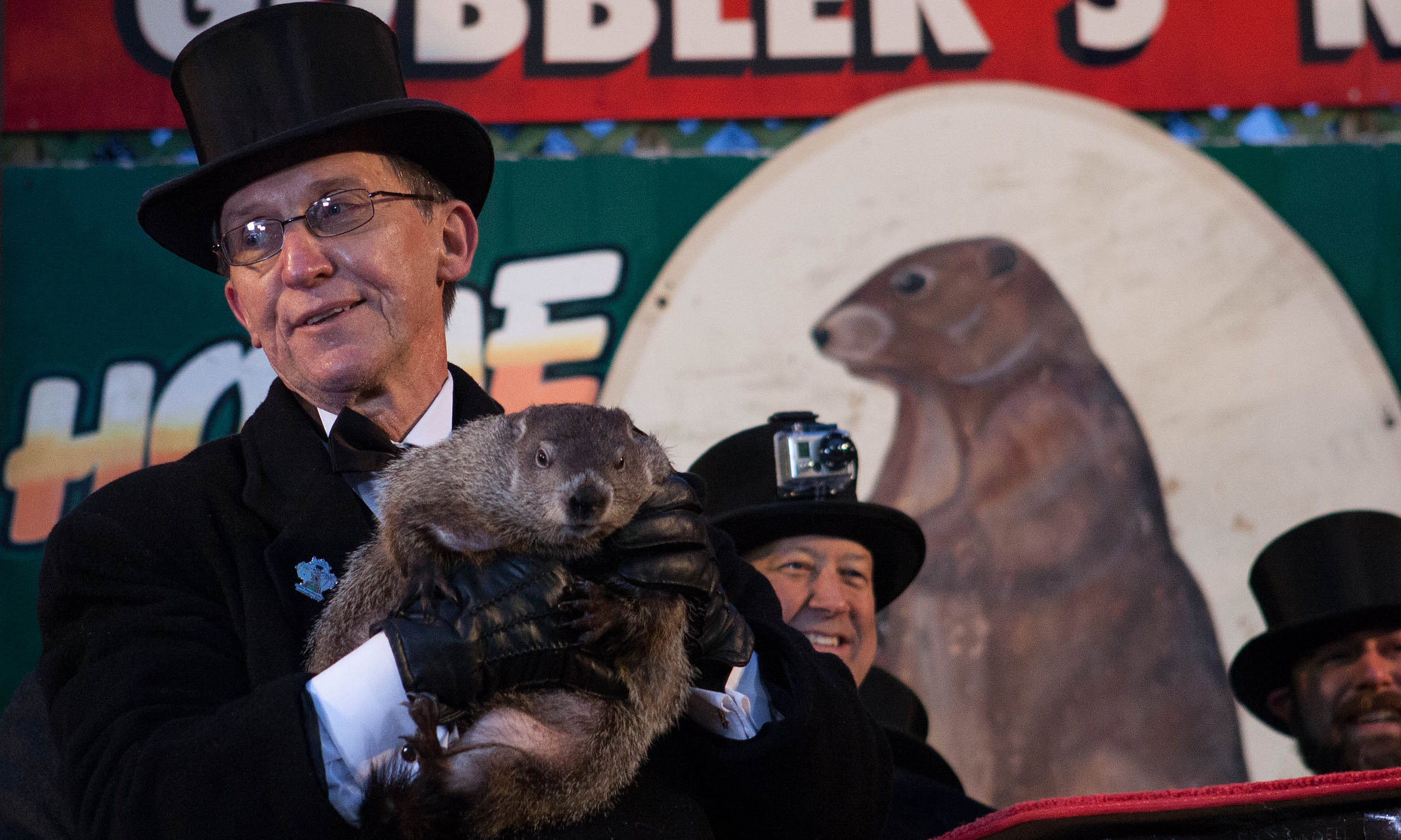
The results were hard on poor Punxsutawney Phil and perhaps sucked a bit of magic out of Groundhog Day, which occurs every year on Feb. 2. As the U.S. tradition goes, if the groundhog emerges from his hole and sees his shadow, there will be six more weeks of winter. If he doesn’t, spring is on its way. (This year he saw his shadow) For the project, Elliott examined 30 years of weather data. She calculated average daily temperatures “during the six weeks after Groundhog Day for years in which Phil saw his shadow and compared them to temperatures of non-shadow years,” according to the story.

A screenshot from The Washington Post’s recent data visualization project on Groundhog Day.
She discovered that it didn’t really matter whether he saw his shadow. No matter what happened, average temperatures “varied by no more than a few degrees,” according to the project.
She decided to present the data on an interactive map allowing users to mouse over each state and see exactly how right or wrong the groundhog was there.
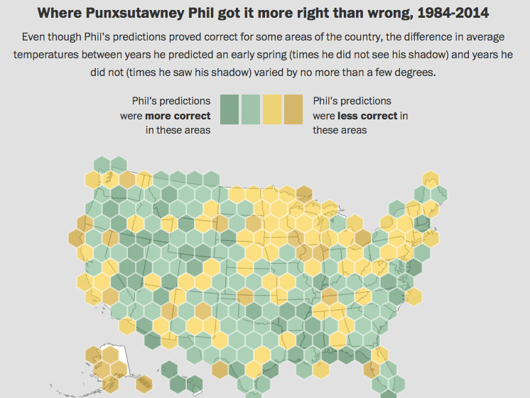
A screenshot from The Washington Post’s recent interactive project on Groundhog Day.
Reader reaction was not universally positive.
“You people clearly have too much time on your hands,” wrote one user in the comments section.
As part of a series on the thinking behind innovative news projects, AJR recently interviewed Elliott on hers. (She created the interactive with Shelly Tan, who did the illustrations.) The excerpts below have been edited and condensed for clarity.
American Journalism Review: What part of the story came first? Did you want to make an interactive story or want to write a story about Groundhog Day and then came up with an idea for the interactive?
Kennedy Elliott: This subject matter typically isn’t something I would cover (my beat is usually politics), but I thought it would be a fun way to cover a celebrated tradition in our country, with a data analysis twist.
AJR: Why did you choose this format [of an interactive map]?
Elliott: I didn’t really choose the format…before starting. I thought about the types of data I could collect to answer a simple question: Is Phil right? I could get data on Phil’s guesses as well as historical weather data around the states by scraping Weather Underground. I played around with some methodologies for testing Phil’s forecasting abilities and ultimately consulted with an economist to settle on the methodology I used.
AJR: Did the format change the way you wrote the story?
Elliott: After compiling, cleaning and analyzing the data, it was obvious that geography played a role in determining how correct Phil was for a particular region of the States, which is why I displayed the data on a map. Because weather is not an independent factor for locations (a location’s temperature can depend largely on the temperature of surrounding areas), we can see interesting patterns develop over the U.S. I wanted to display that.
AJR: How much work was put into it?
Elliott: The entire project took about a week start to finish to conceptualize, sketch, scrape, program and publish. … I was lucky that I had a bit more time to experiment with this piece. In fact, there was a lot more I wanted to add about erratic temperature patterns that I uncovered due to scraping 30 years of weather data for 250 locations in the U.S. but I couldn’t quite make it work in time. I’ll hope to recycle that concept for a future project.
AJR: What was the reaction from readers?
Elliott: Reaction from readers is always mixed on this type of project – people tend to have mixed feelings about “fun” graphics and interactives, which is totally fair. A lot of people enjoyed it, but investigating whether or not a groundhog can accurately predict weather isn’t everyone’s cup of tea, and rightly so. I do a lot of political data visualizations, so for me, it was a quick, fun break from that and a chance to work with Shelly Tan, who is an incredible illustrator.
AJR: Would you do a story of this nature again?
Elliott: I’m not sure if I will do pieces like these very often in the upcoming presidential election cycle, but I hope I do at some point. As journalists, we always aim to inform, but our secondary motivations can vary – perhaps to inspire, to amuse, and, yes, even sometimes to apply statistical frameworks to exploring the accuracy of a groundhog’s ability to forecast the weather.